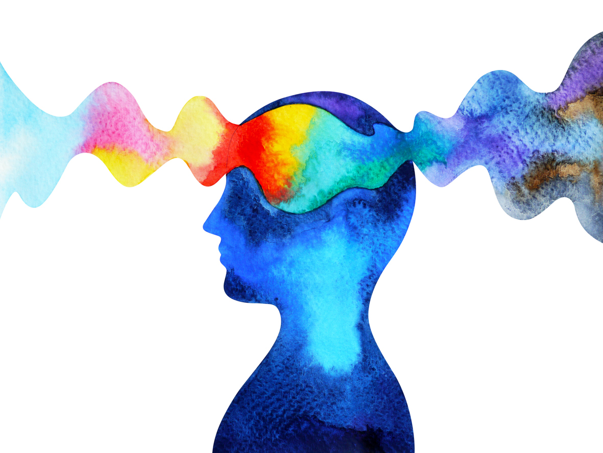
Colors are more than just a visual aspect of our world; they hold immense power in influencing how we think, feel, and behave. From the clothes we pick to the brands we trust, colors subtly shape our decisions every day. But how exactly does this happen? And how can you harness this knowledge to make better or more informed choices? Let’s explore how the psychology of color affects everyday life and how you can use it to your advantage.
Blue Promotes Trust and Calm
Ever wondered why many financial institutions, healthcare providers, and tech companies use blue in their branding? Blue is often associated with trust, stability, and serenity. This soothing color has a calming effect on the human mind, which explains why it’s a favorite in high-stress settings.
Practical Tip: Wearing blue to a job interview or important meeting can subconsciously convey reliability and confidence. It’s also a great color for workspaces if you want to maintain focus and a sense of calm.
Red Triggers Urgency and Passion
Red is one of the most vibrant and eye-catching colors, often linked to passion, energy, and urgency. That’s why you’ll often see red used in sales promotions or clearance signs. It grabs attention and creates an emotional sense of urgency or excitement.
Example: A 2019 study published in Psychology Today noted that red packaging can encourage consumers to make quicker purchasing decisions.
Practical Tip: Use red in moderation. It works well for creating excitement in advertisements or motivating action (like hitting “Buy Now”), but too much of it can feel overwhelming.
Yellow Inspires Optimism and Creativity
Yellow is a cheerful color that catches the eye and evokes feelings of happiness and energy. It’s often associated with creativity and innovation, making it popular for brands or individuals aiming to emphasize positivity.
Example: Companies like IKEA use yellow to represent a sense of joy and innovation, aligning with their goal of being a problem-solving brand for the home.
Practical Tip: Add yellow accents to creative spaces in your home or office to spark inspiration or place it strategically in presentation visuals to convey energy and optimism.
Green Reflects Balance and Growth
Green is connected to nature, health, and growth, and people typically associate it with feelings of balance and renewal. That’s why restaurants, organic food brands, and environmentally-minded companies favor green.
Example: Whole Foods’ green logo reinforces its commitment to sustainability and organic food.
Practical Tip: Incorporate more green into your environment if you want to feel grounded or reduce stress. It’s particularly effective in rooms where relaxation is key, like a bedroom or a cozy corner for reading.
Black Symbolizes Power and Sophistication
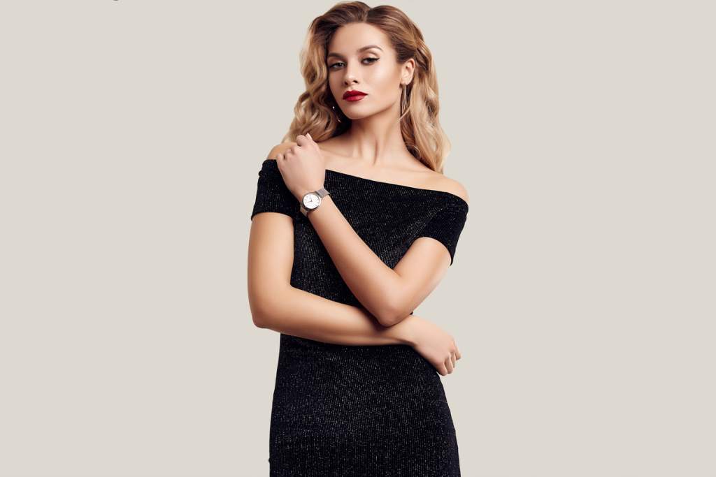
Black is often linked with elegance, power, and authority. Brands like Chanel and Apple use black to signify sophistication and high quality. Interestingly, black is also viewed as a protective, authoritative color, making it ideal for formal settings.
Example: Research from the Journal of Psychology & Marketing found that consumers often associate black packaging with premium, high-end products.
Practical Tip: Knowing that black exudes confidence, consider adding it to your wardrobe for formal events, or use it sparingly in designs to emphasize luxury.
White Represents Simplicity and Freshness
White signifies cleanliness, simplicity, and purity, which explains its popularity in minimalist design and branding for healthcare or beauty industries. Think about brands like Apple’s clean aesthetic or Dove’s fresh, simple packaging.
Practical Tip: Incorporate white space into designing your home or website layouts to create a sense of openness and clarity. For personal use, white works beautifully in rooms where you want to encourage focus and simplicity.
Purple Suggests Creativity and Luxury
Once associated with royalty, purple continues to carry a sense of luxury, mystery, and imagination. Brands like Cadbury leverage this perception to align with ideas of indulgence and richness.
Practical Tip: Use touches of purple in special occasion outfits or as accents in branding materials if you want to create a feeling of exclusivity or creativity.
Color Combinations and Context Matter
While individual colors have distinct psychological effects, their impact often depends on how they’re combined and the context in which they’re used. For example, a bright red-on-yellow combination may create urgency (think fast-food branding), whereas black and gold exude high-end sophistication.
Practical Tip: Next time you design or choose something, think about the color pairing. Are they complementing each other or clashing? Play around with different combinations to see how they feel and what message they convey.
How to Apply the Psychology of Color in Daily Life
Whether you’re picking an outfit, designing a logo, redecorating a room, or just trying to understand how to advertise your small business better, color psychology gives you practical insight into how people react to visual cues.
Practical Takeaway:
- Use blue and green shades in professional or calming settings.
- Incorporate reds and yellows to spark attention or excitement but keep them balanced.
- Opt for neutrals like black and white for sophistication and purity.
Create Intentional Choices with Color
Colors are silently influencing your day-to-day decisions—from the apps you use to the items you buy. By understanding the psychology of color, you can make more intentional decisions that positively shape moods, inspire actions, or communicate effectively.
Start experimenting with colors in your own life to see the change they can bring. Small shifts in color choices can lead to big results. Why not give it a try today?